Posts

Research: Private Eye

Image

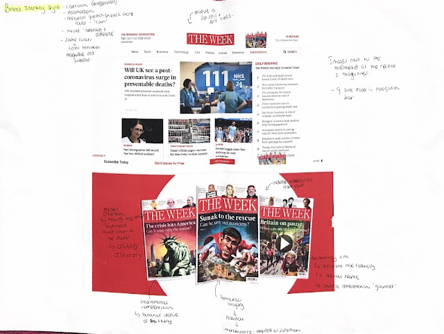
Research: The Week

Image

Research: Time

Image

Research: Private Eye

Image

Jungle Book Character Comparison

Image
 Mowgli 1967                                                                      2016 - A c lear difference between the 1967 version and the 2016 Mowgli is that one is a drawn animated and the other is a real life actor. Both have a similar body type and the actor used in the 2016 version is from India which is keeping in line that the film is set in the Indian jungle. Furthermore, he is seen as innocent looking in both however the 2016 Mowgli seems more competent in the Jungle. Baloo      1967                                            2016      - One difference is that Baloo in the 2016 is much larger and bulkier and is much more of a bear rather than the fun cuddly loo...

Jungle Book Settings Comparison

Image
 The waterhole/waterfall     1967                                                                   2016 - The 1967 design in comparison to the 2016 waterhole is much more colourful and vibrant representing the child like quality of it. Moreover, the colours are much more subdued in the 2016 representation to create a more mature and realistic quality. The Jungle 1967                                                                      2016 - Furthermore, both representations of the jungle have used a lot of greens however the 1967 design uses more variants and shades of green whereas the 2016 version uses similar tones of greens and...

Planning: Generating mastheads and experimenting with fonts

Image
Font experimenting for Current Affairs Titles: - For the Current Affair Magazine name 'Currently' I wanted to experiment around with the first letter C at the beginning and making it fancier to create a recognisable title name but also I could use it to create a logo. Here are the results: - Decretive font- I like the stylised C that's significantly bigger compared to the other letters- good emphasis. However I don't think its suitable for my target audience age of 16-25. - Bold clear letter C, however following letters don't match the same boldness/thickness and overall makes the C mismatched. - I like the shape and style of the letter C- interesting to see but the whole look doesn't suit my theme of magazine. - One of my favourite outcomes, it's all the same tone, clear to read, the C is not too decretive and the rest of the letters sit nicely inside of the large C. - Looks appealing to the eye however its way to decorative an...