Planning: Generating mastheads and experimenting with fonts
Font experimenting for Current Affairs Titles:
- For the Current Affair Magazine name 'Currently' I wanted to experiment around with the first letter C at the beginning and making it fancier to create a recognisable title name but also I could use it to create a logo. Here are the results:


- I like the shape and style of the letter C- interesting to see but the whole look doesn't suit my theme of magazine.

- One of my favourite outcomes, it's all the same tone, clear to read, the C is not too decretive and the rest of the letters sit nicely inside of the large C.


- I like the style of font used for the capital T and H in the title- however it is slightly hard to read and is on the decrative side.


- Same font used as the one above beside the extra words- it does look nice however the T looks like a decretive J which could be confusing. Could also have the magazine called 'Happenings'

- The boldness tones are mismatched with the beginning letter and the rest- the styles don't match up together,

- Serif font- bold and thick for impact- legible to read, the simplest but still very effective. Clean/polished look.
Colour Edit ideas:


- For the Current Affair Magazine name 'Currently' I wanted to experiment around with the first letter C at the beginning and making it fancier to create a recognisable title name but also I could use it to create a logo. Here are the results:
- Decretive font- I like the stylised C that's significantly bigger compared to the other letters- good emphasis. However I don't think its suitable for my target audience age of 16-25.
- Bold clear letter C, however following letters don't match the same boldness/thickness and overall makes the C mismatched.
- I like the shape and style of the letter C- interesting to see but the whole look doesn't suit my theme of magazine.
- One of my favourite outcomes, it's all the same tone, clear to read, the C is not too decretive and the rest of the letters sit nicely inside of the large C.
- Looks appealing to the eye however its way to decorative and doesn't meet the design brief of a current affairs magazine.
Now here's my font experiments for the title The Happenings. I also played around with the name being just 'Happening'.
Now here's my font experiments for the title The Happenings. I also played around with the name being just 'Happening'.
- I like the style of font used for the capital T and H in the title- however it is slightly hard to read and is on the decrative side.

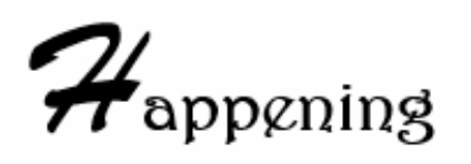
- Nice smooth stylised font- equal thickness and the rest of the letters fit nicely along the bottom line of the H

- Same font used as the one above beside the extra words- it does look nice however the T looks like a decretive J which could be confusing. Could also have the magazine called 'Happenings'
- The boldness tones are mismatched with the beginning letter and the rest- the styles don't match up together,
- Serif font- bold and thick for impact- legible to read, the simplest but still very effective. Clean/polished look.
Colour Edit ideas:


- I noticed with a lot of magazine mastheads they follow a similar theme of a bold red box with the title name inside- usually white. By using the red it instantly draws the audiences eyes in and its the first thing they see- which is why designing a masthead like this is very effective. I also made the outline of the box a thin black colour alongside the font being outlined in black to add further depth to the title.

Comments
Post a Comment